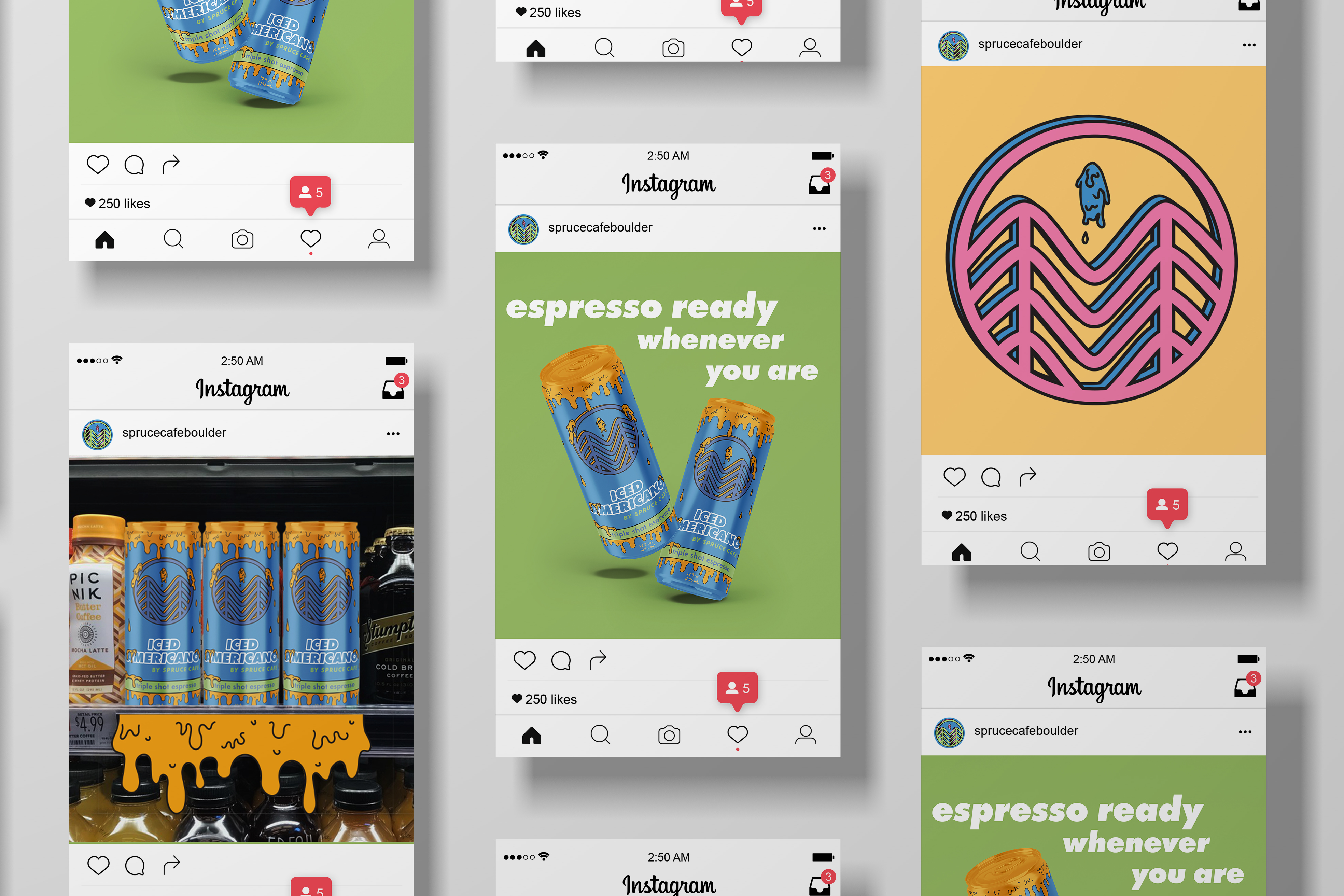
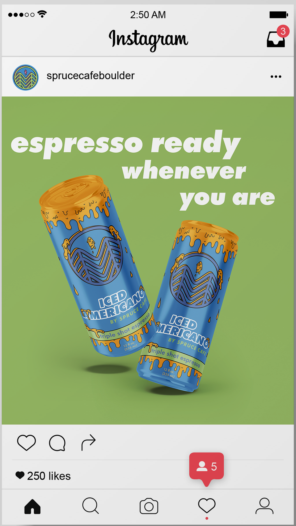
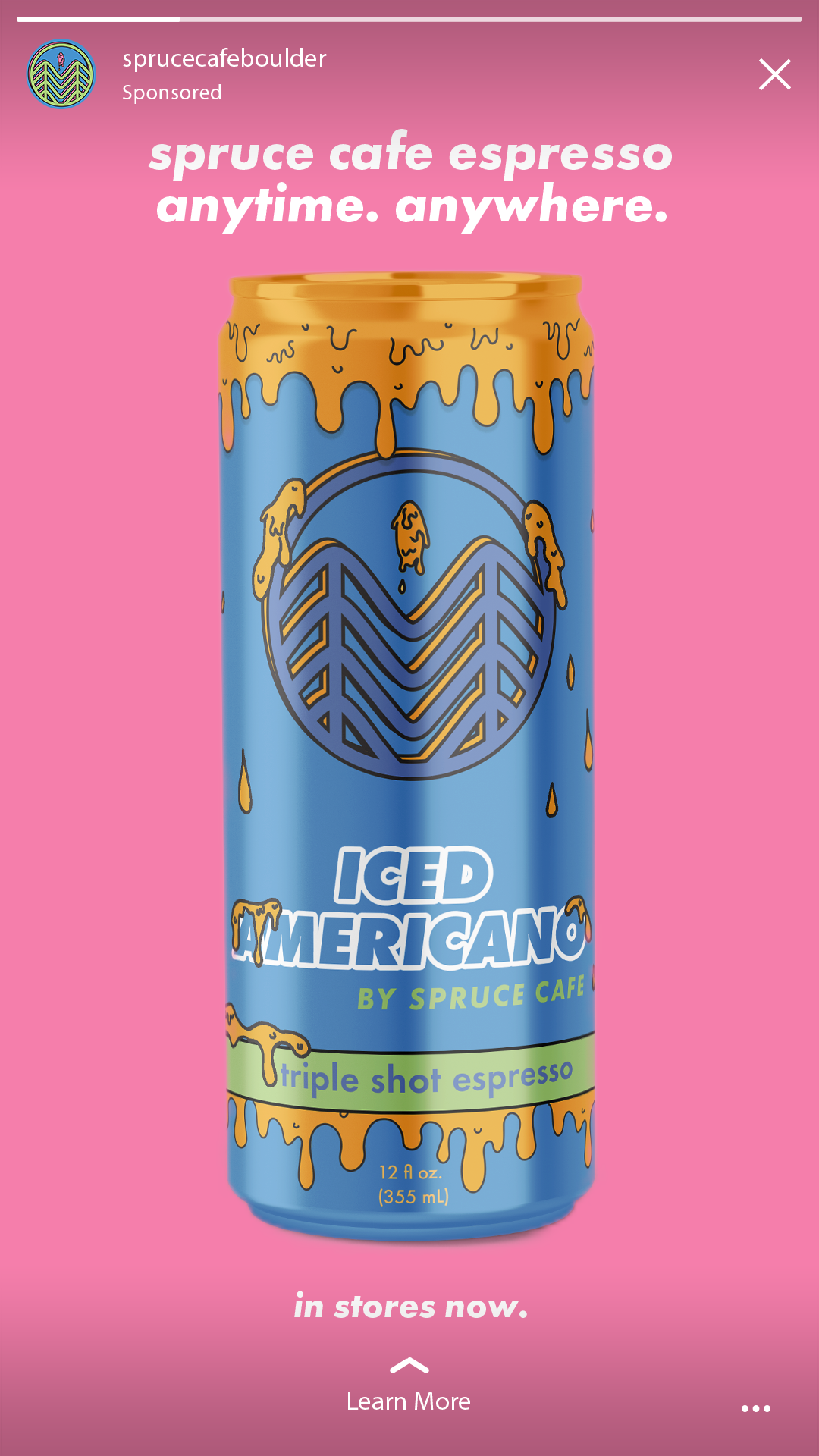
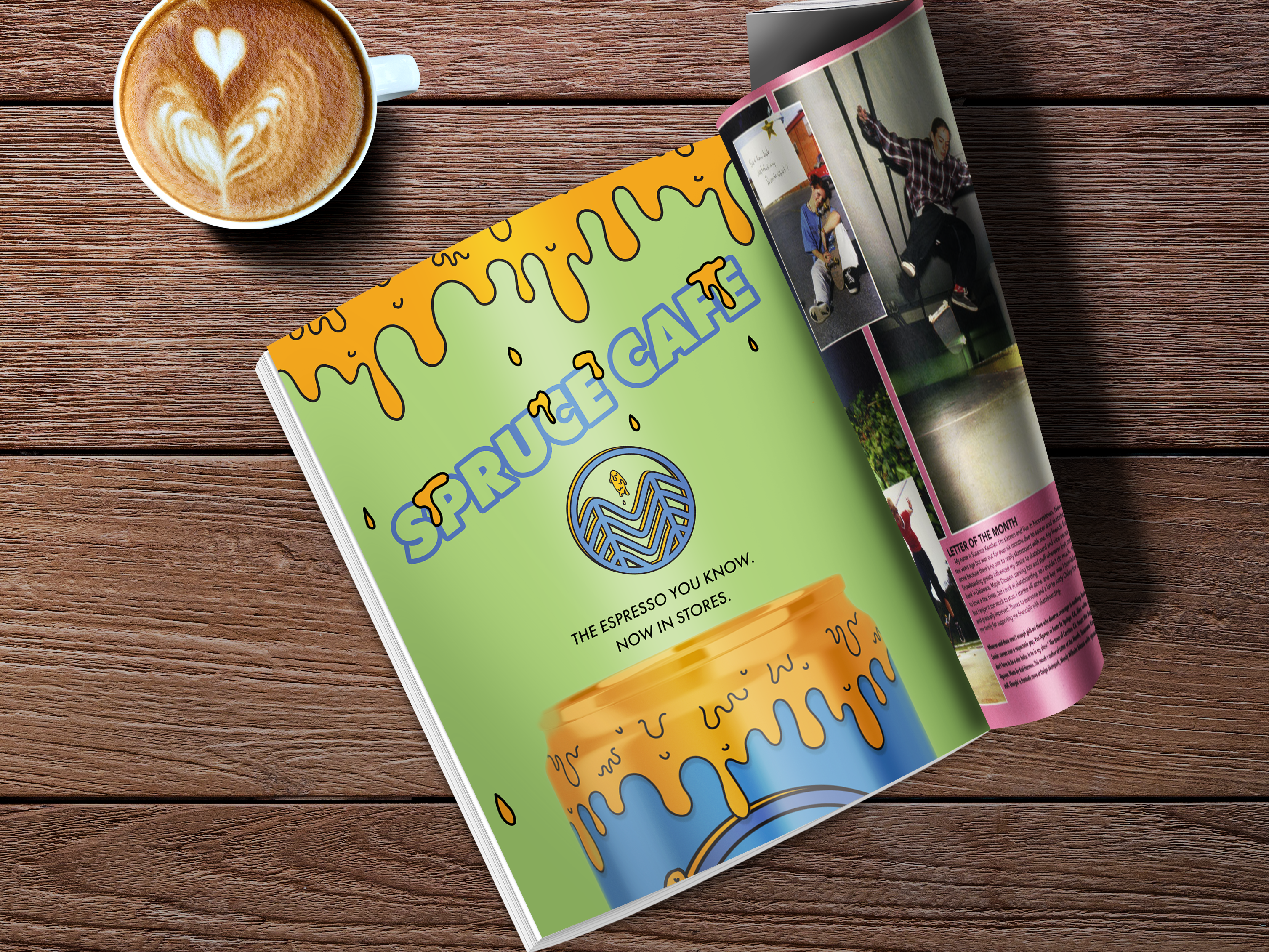
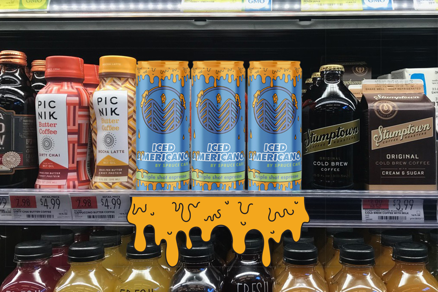
A Colorado coffee franchise needed packaging as bold as its flavor. This is a conceptual integrated campaign for a ready-to-drink espresso beverage from Spruce Cafe.
The Americano
Spruce Cafe
Conceptual
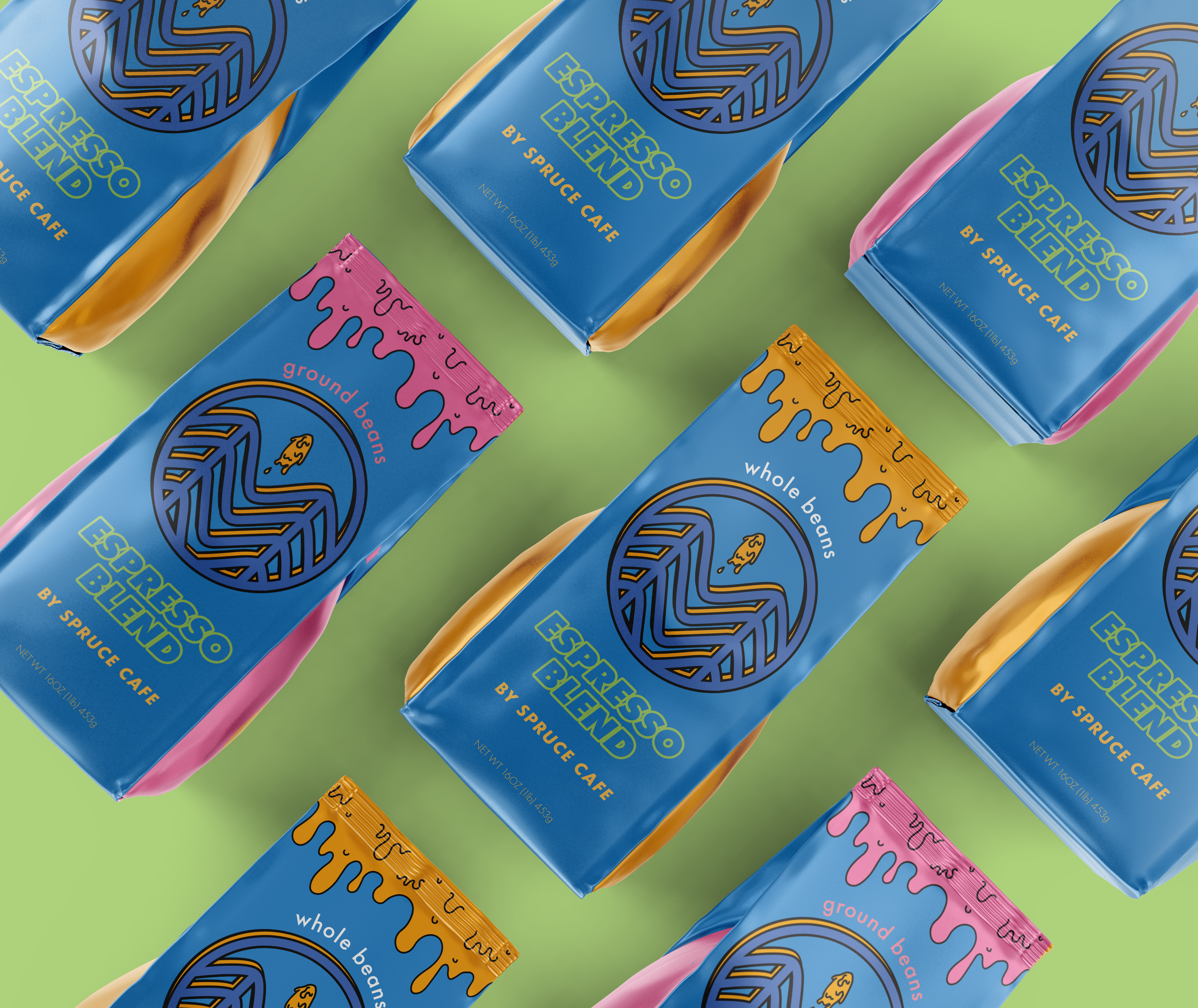
Packaging
Logo design
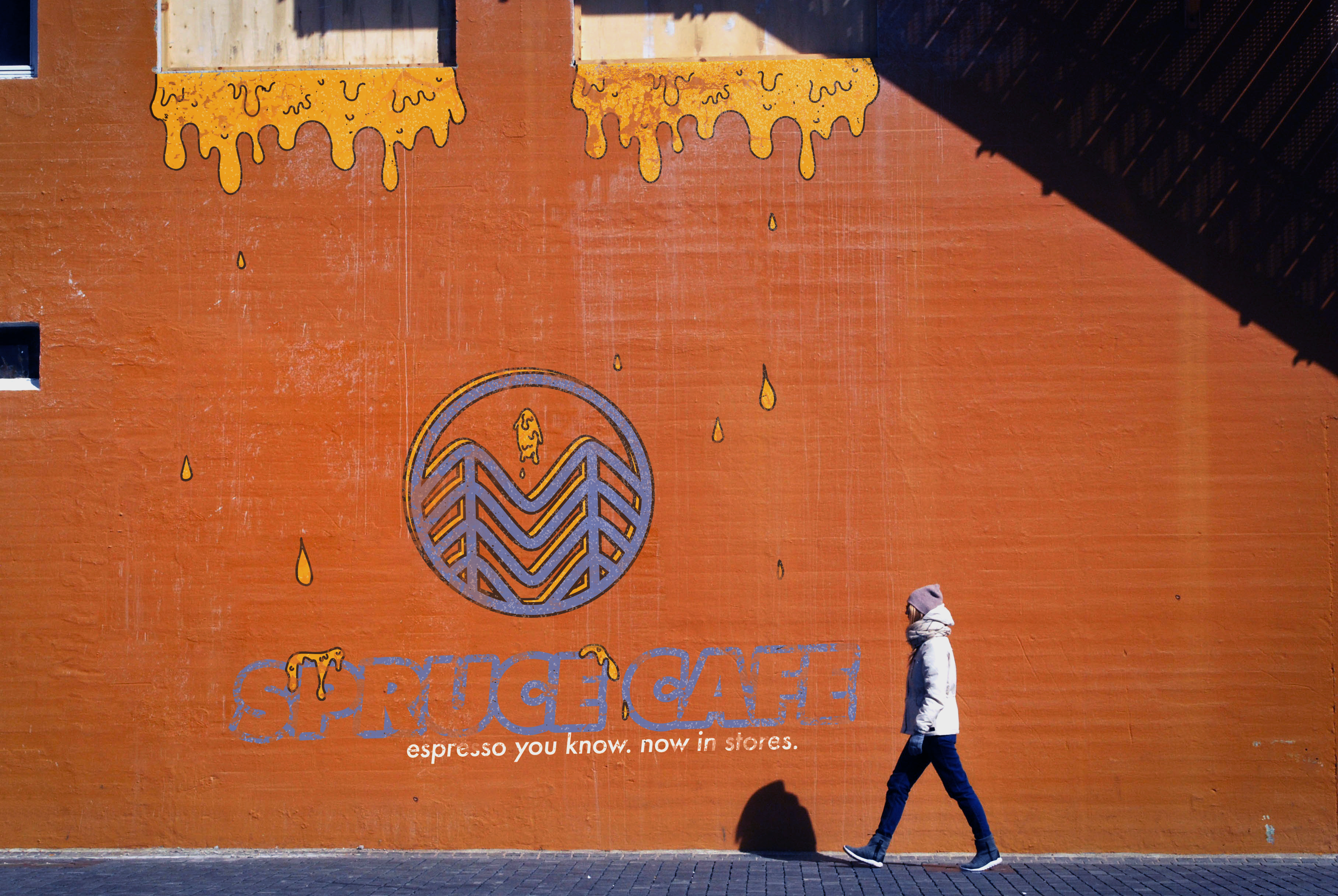
Intergrated campaign -- social, OOH, print, creative
Spruce Cafe
Conceptual
Packaging
Logo design
Intergrated campaign -- social, OOH, print, creative
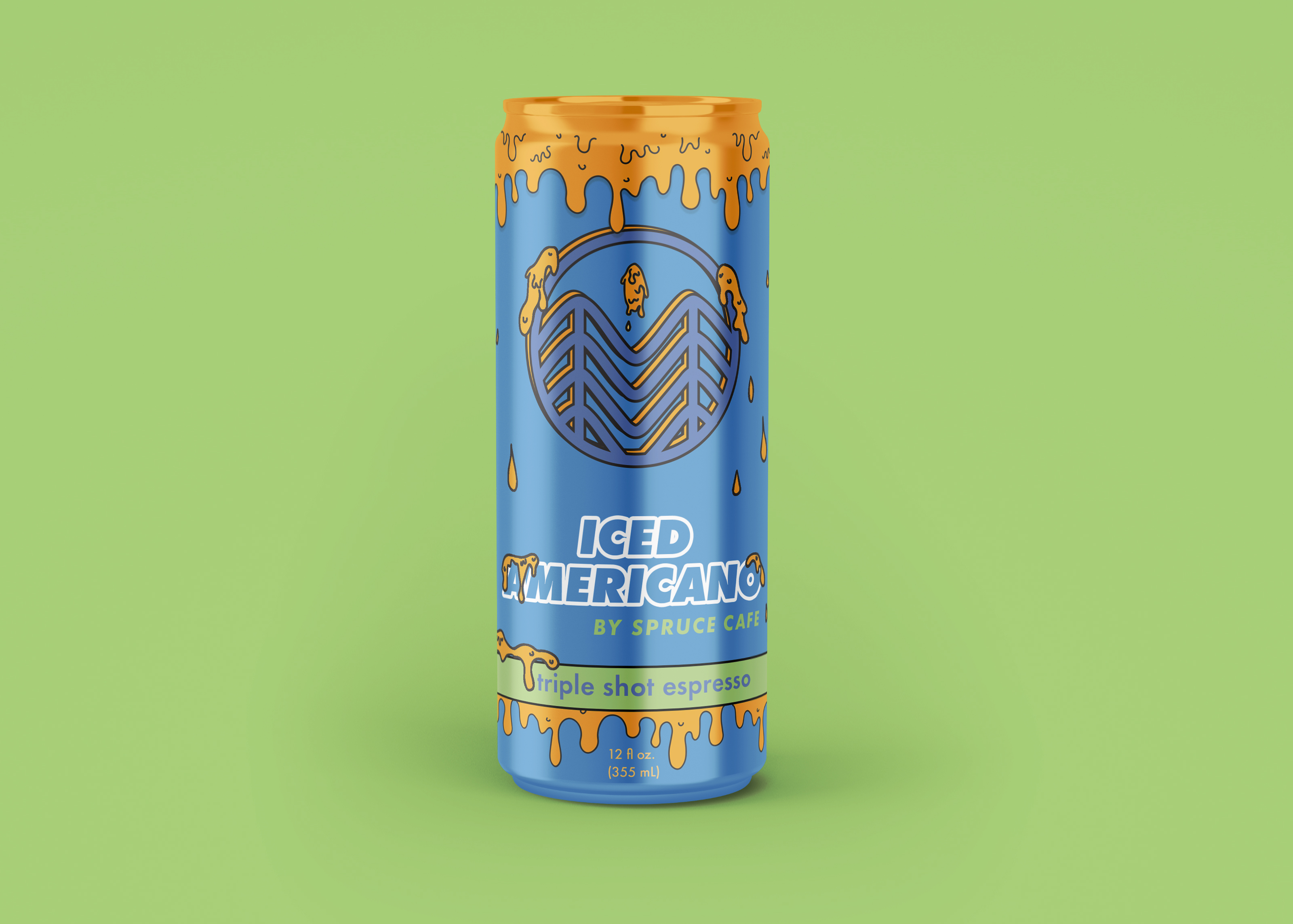
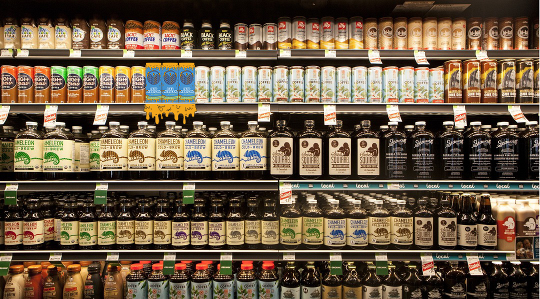
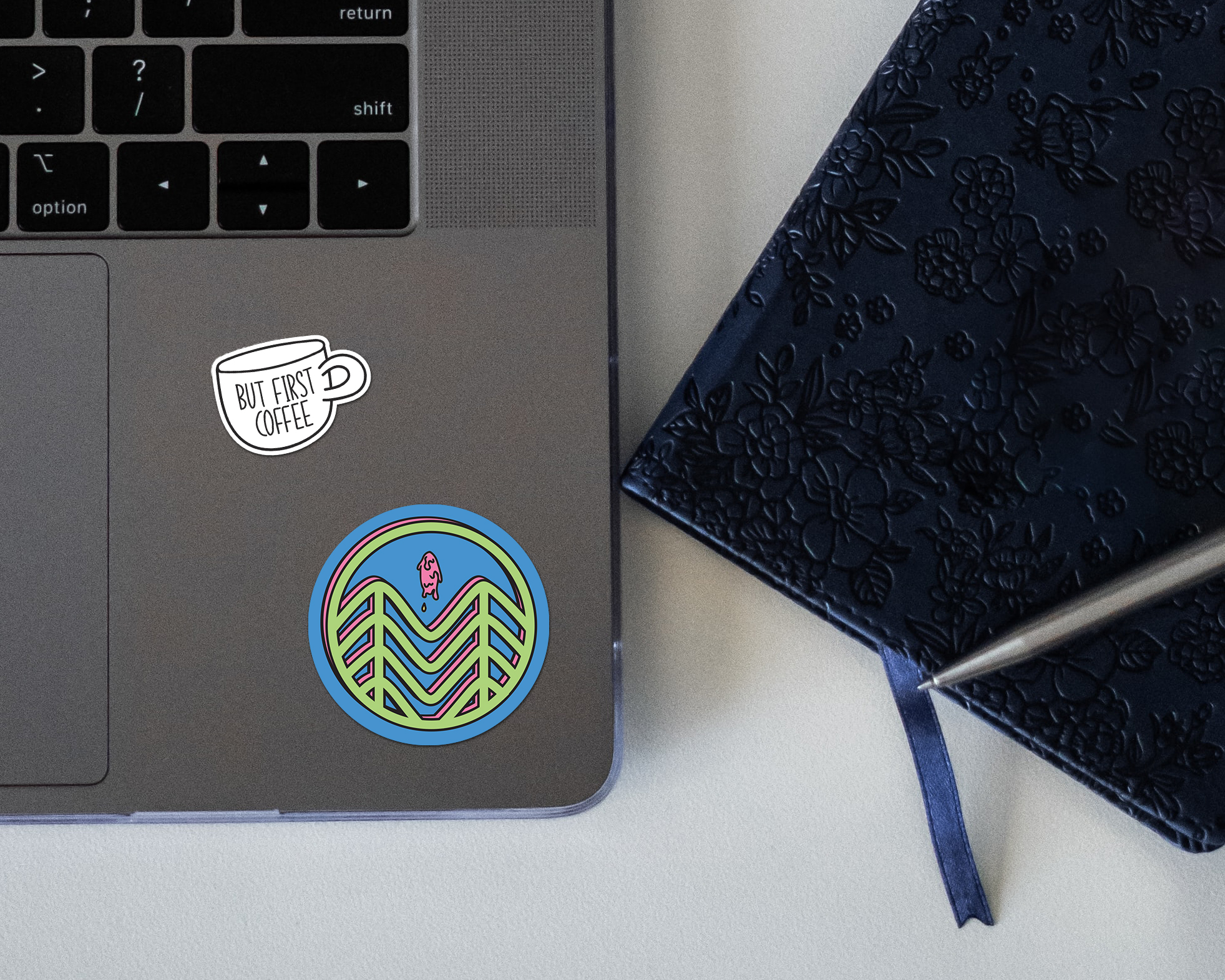
Branding for Ready to drink Espresso is universally dark color schemes and sleek graphics, relfecting the intensity of the contents flavor. But Spruce isn’t intense -- it’s bold and bright and fun. This new design reflects Spruce’s individuality and it disrupts a sea of browns and black cans.
While Spruce’s current branding is handrawn and friendly, this design is a pop art, 3D, modern logo inspired by Spruce's classic color palette and the underground Grime Art Movement. It also trims Spruce’s logo to just their most iconic symbol - the two spruce insignia.
While Spruce’s current branding is handrawn and friendly, this design is a pop art, 3D, modern logo inspired by Spruce's classic color palette and the underground Grime Art Movement. It also trims Spruce’s logo to just their most iconic symbol - the two spruce insignia.